ShopDreamUp AI ArtDreamUp
Deviation Actions


Suggested Collections


You Might Like…


![[C] Jesse](https://images-wixmp-ed30a86b8c4ca887773594c2.wixmp.com/f/f26c0ec6-a209-4eeb-9be2-64a0527c0fc2/d5nstrb-ce774c65-bbe3-459e-a280-6866b781668c.png/v1/crop/w_184,h_184,x_0,y_19,scl_0.17342130065975,q_70,strp/_c__jesse_by_lufidelis_d5nstrb-92s-2x.jpg?token=eyJ0eXAiOiJKV1QiLCJhbGciOiJIUzI1NiJ9.eyJzdWIiOiJ1cm46YXBwOjdlMGQxODg5ODIyNjQzNzNhNWYwZDQxNWVhMGQyNmUwIiwiaXNzIjoidXJuOmFwcDo3ZTBkMTg4OTgyMjY0MzczYTVmMGQ0MTVlYTBkMjZlMCIsIm9iaiI6W1t7ImhlaWdodCI6Ijw9ODQ5IiwicGF0aCI6IlwvZlwvZjI2YzBlYzYtYTIwOS00ZWViLTliZTItNjRhMDUyN2MwZmMyXC9kNW5zdHJiLWNlNzc0YzY1LWJiZTMtNDU5ZS1hMjgwLTY4NjZiNzgxNjY4Yy5wbmciLCJ3aWR0aCI6Ijw9NjAwIn1dXSwiYXVkIjpbInVybjpzZXJ2aWNlOmltYWdlLm9wZXJhdGlvbnMiXX0.Q9ztsHV0K6JVHCUIXGWrf-T_22dGYsy2KjRD0MH1ZJU)
![[C] Jesse](https://images-wixmp-ed30a86b8c4ca887773594c2.wixmp.com/f/f26c0ec6-a209-4eeb-9be2-64a0527c0fc2/d5nstrb-ce774c65-bbe3-459e-a280-6866b781668c.png/v1/crop/w_92,h_92,x_0,y_10,scl_0.086710650329877,q_70,strp/_c__jesse_by_lufidelis_d5nstrb-92s.jpg?token=eyJ0eXAiOiJKV1QiLCJhbGciOiJIUzI1NiJ9.eyJzdWIiOiJ1cm46YXBwOjdlMGQxODg5ODIyNjQzNzNhNWYwZDQxNWVhMGQyNmUwIiwiaXNzIjoidXJuOmFwcDo3ZTBkMTg4OTgyMjY0MzczYTVmMGQ0MTVlYTBkMjZlMCIsIm9iaiI6W1t7ImhlaWdodCI6Ijw9ODQ5IiwicGF0aCI6IlwvZlwvZjI2YzBlYzYtYTIwOS00ZWViLTliZTItNjRhMDUyN2MwZmMyXC9kNW5zdHJiLWNlNzc0YzY1LWJiZTMtNDU5ZS1hMjgwLTY4NjZiNzgxNjY4Yy5wbmciLCJ3aWR0aCI6Ijw9NjAwIn1dXSwiYXVkIjpbInVybjpzZXJ2aWNlOmltYWdlLm9wZXJhdGlvbnMiXX0.Q9ztsHV0K6JVHCUIXGWrf-T_22dGYsy2KjRD0MH1ZJU)


Featured in Groups


Description
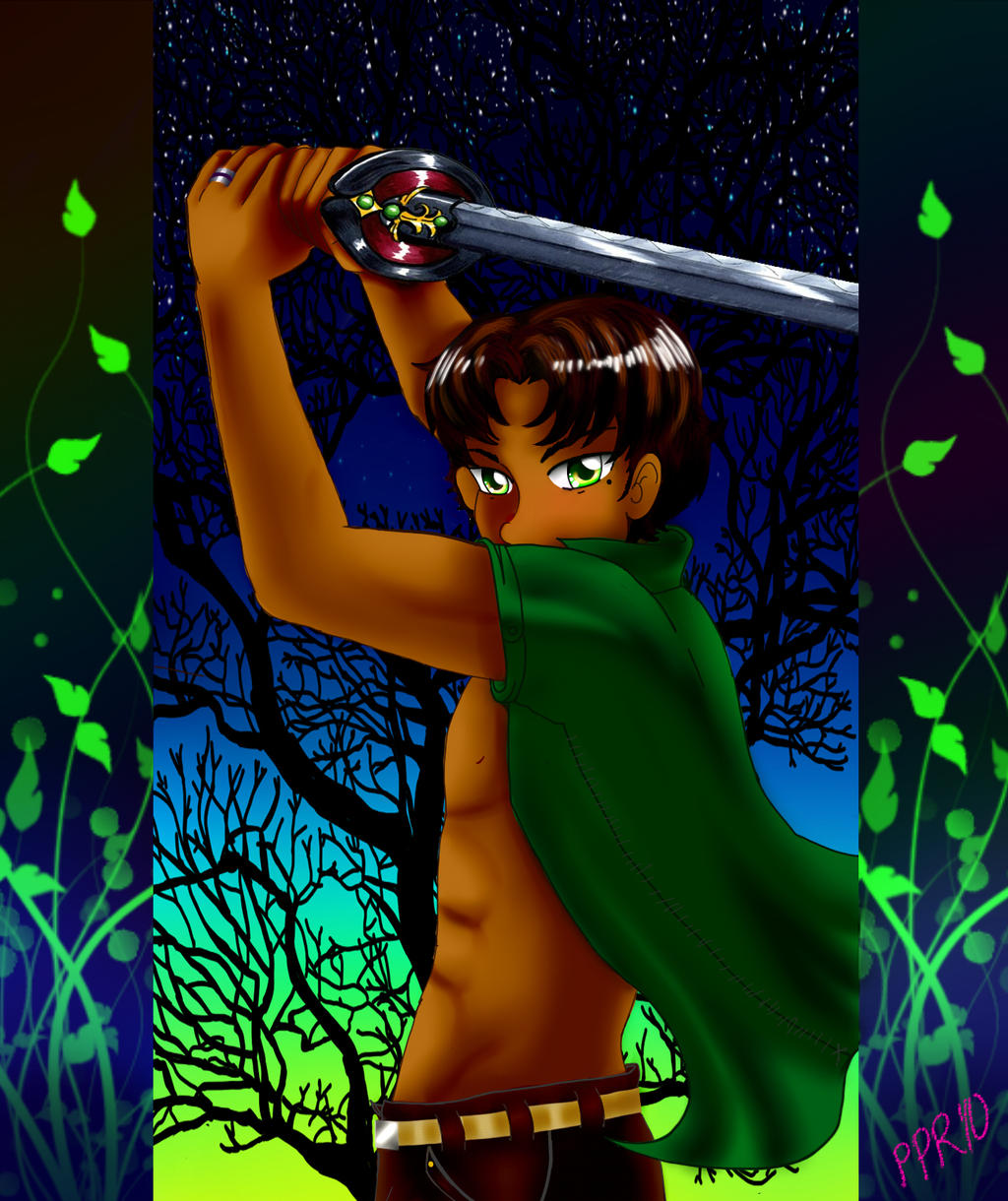
It's Mike from  's SOA fansaga.
This is my attempt to redo an older pic of mine.
Here is the old version---->
I think I've improved a little since then... maybe....
Anyway, enjoy!
's SOA fansaga. This is my attempt to redo an older pic of mine.
Here is the old version---->
I think I've improved a little since then... maybe....
Anyway, enjoy!
Image size
1296x1544px 1.77 MB
© 2010 - 2024 pinkplaidrobot
Comments25
Join the community to add your comment. Already a deviant? Log In
There's definitely some improvement. The old skin tone was very wooden, and this one does look more like skin, but you can go further. A lot of artists stick too much to "skin tones" (brown, tan, peach, etc.) when coloring skin, but lighting can create all sorts of colors on skin. In this piece, for example, I'd recommend putting a tinge of a dull blue-green in the shadows, and then a bit of brighter green or yellow-green on the highlights, to complement the background. I'd recommend trying to blend it in so it looks more like color and less like reflected light.
As for anatomy, eh, maybe a little on the too thin/too long side, but that's not the biggest problem. For the abs, I'd recommend either less chiseling (i.e. less dark shading) or make them rounder and more three-dimensional. Each ab is its own shape, and they shouldn't follow a smooth curve down the stomach. It's easy to overdo, but curve them a little bit.
The hands, arms, and swords, are the biggest problem here. Of course, it's a difficult motion to draw, but look at where the left hand is placed. Now trace a straight line from the hilt of the sword backwards. It doesn't really look like his hand is grasping the hilt- the positioning is off. For the right hand, I'd recommend poking the thumb out more so we can see it by itself, and make it look like it's grabbing something bigger. Basically, don't have the fingers bend so close to the heel of the hand-it's hard to describe, so experiment a little.
As for the sword, the blade needs to be foreshortened-the blade and the hilt are at completely different angles right now. At this angle, that little part of the hilt connected right to the blade should hardly be visible, and the blade itself should be angled more 'forward'-closer to the viewer.
The rest is just aesthetic stuff, so ignore it if you want to-I obviously don't know the story behind the character. A lot of things about the character-the covered mouth, the hooded eyes, the clothes, the exposed abs-say 'antihero' or 'antagonist' to me. Even if he isn't, the pose if very defensive and wary. With that in mind, the colors of the background in particular are so bright that it's kind of jarring when put together. With a character design/pose like this, I'd personally use darker or cooler colors. Maybe some dry leaves blowing around or clouds in the background. Again, ignore this if you want, but it seems that way to me.